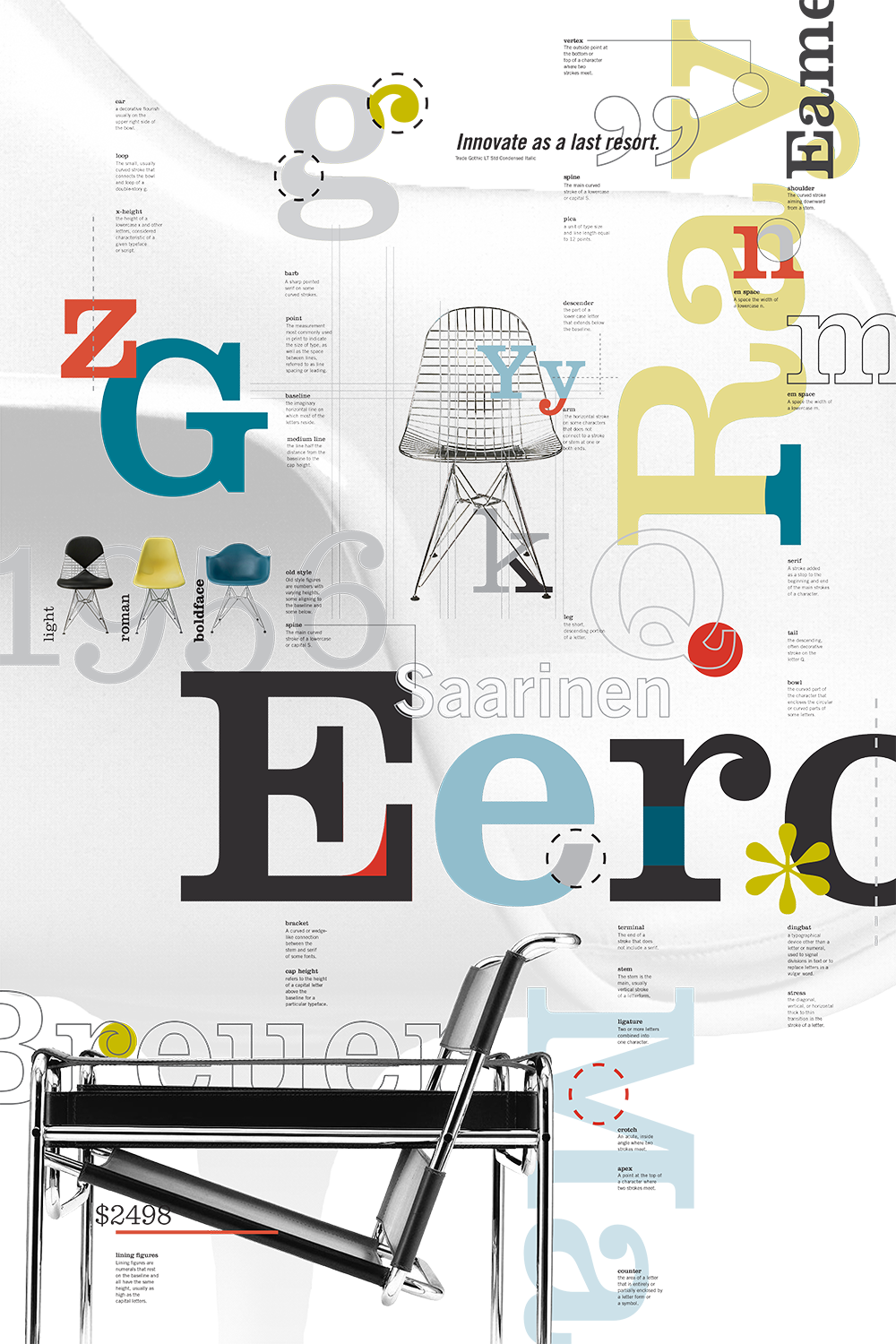
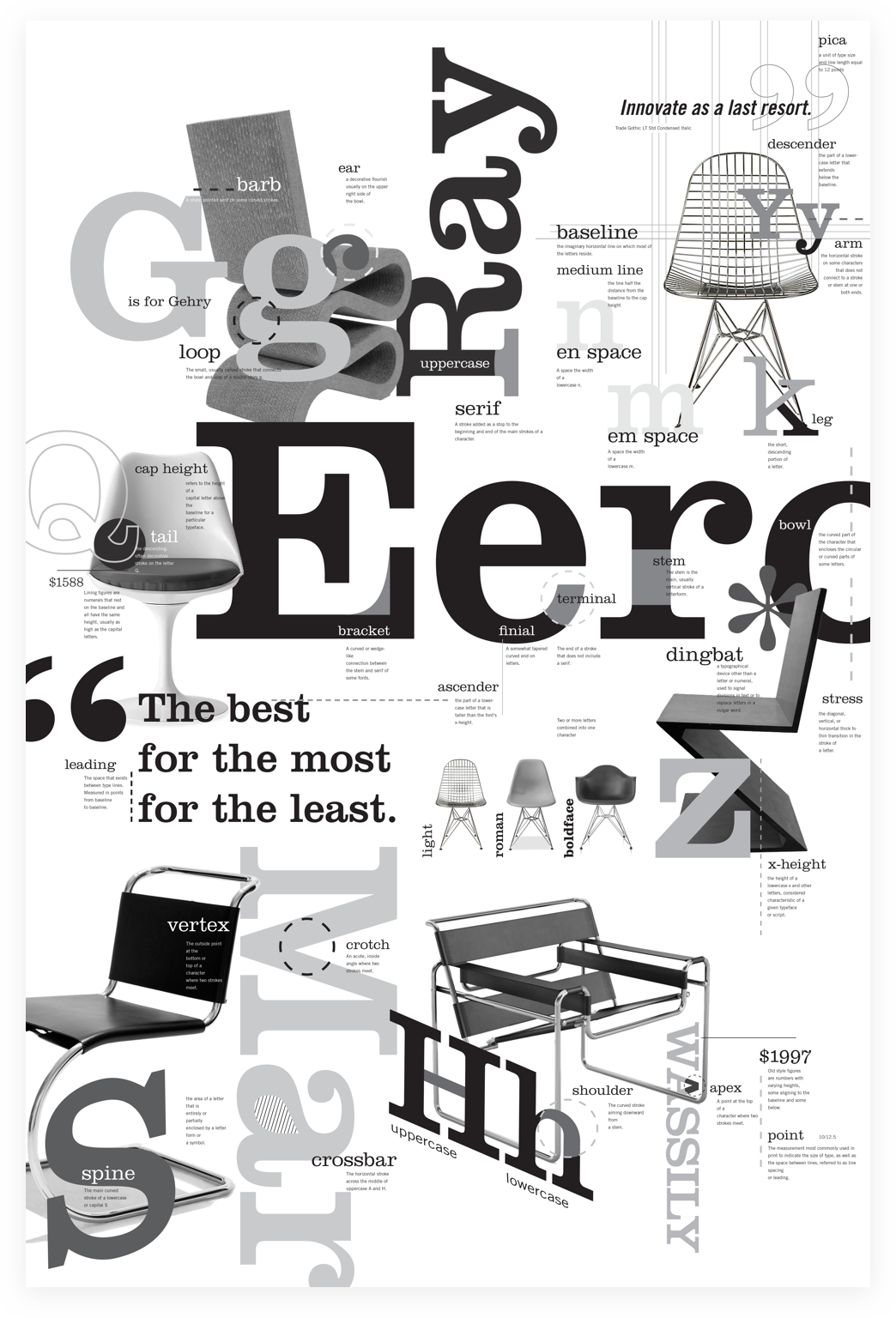

The first multiple rounds of iteration on the poster were in black and white, and I struggled knowing the beautiful colors both in the chairs and that I wanted to include in my type. However, these iterations allowed me to resolve layout and movement before the fun things like color. By paying close attention to vertical alignment of all of my terms, I was able to create a movement down the page and split the poster into quadrants. Setting the Tulip Chair large and faded in the background made the poster feel like a welcoming space in which all fifty of my type terms live.
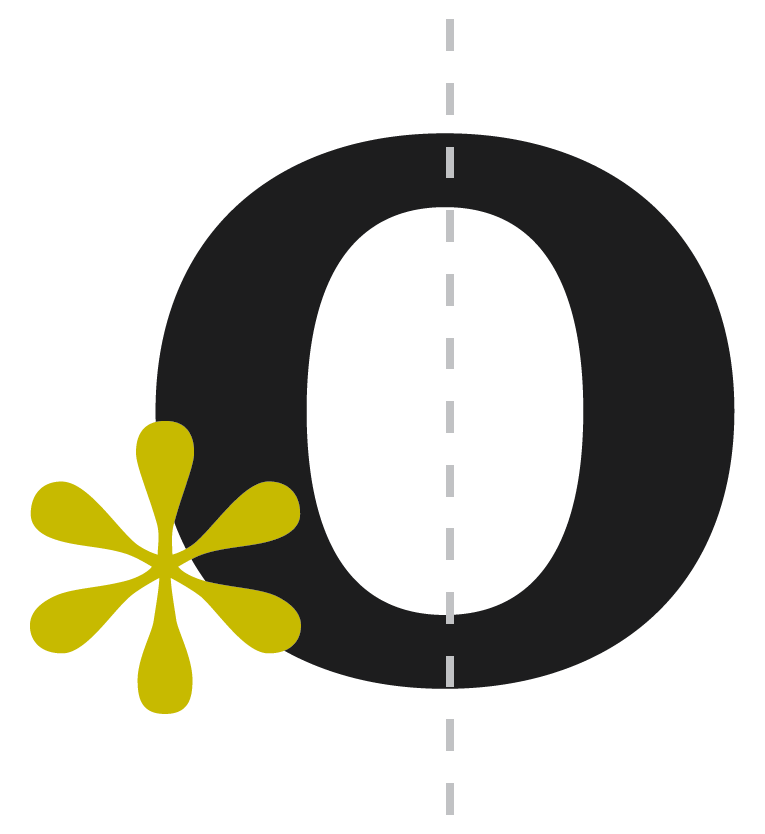
In Typography II with Professor Mark Laughlin, we spent half of the semester developing a poster illustrating fifty typographic terms. I had recently discovered the book Dogs & Chairs: Designer Pairs by Cristina Amodeo and wanted to explore the same concept, but with my favorite chairs by architects. As I iterated on the concept, I found that many chairs mimic the forms of letters, and work well to illustrate the many terms that we had to define, typeset, and show an example of.Being a little bit of a nerd for both typefaces and chairs, this project was one of my favorites to spend time on. I loved pouring myself into the little details, like a play on font weights and the Eames molded plastic chairs.
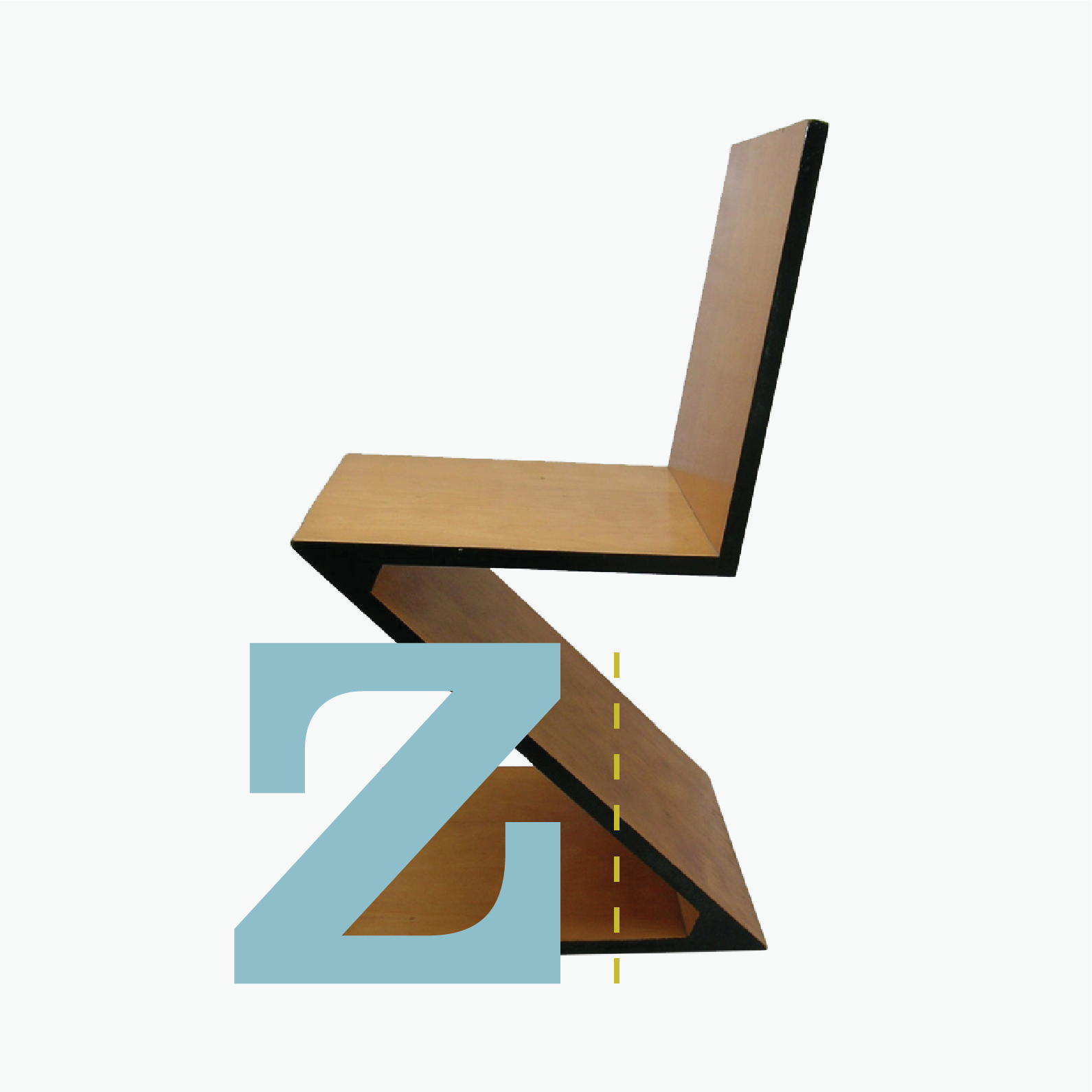
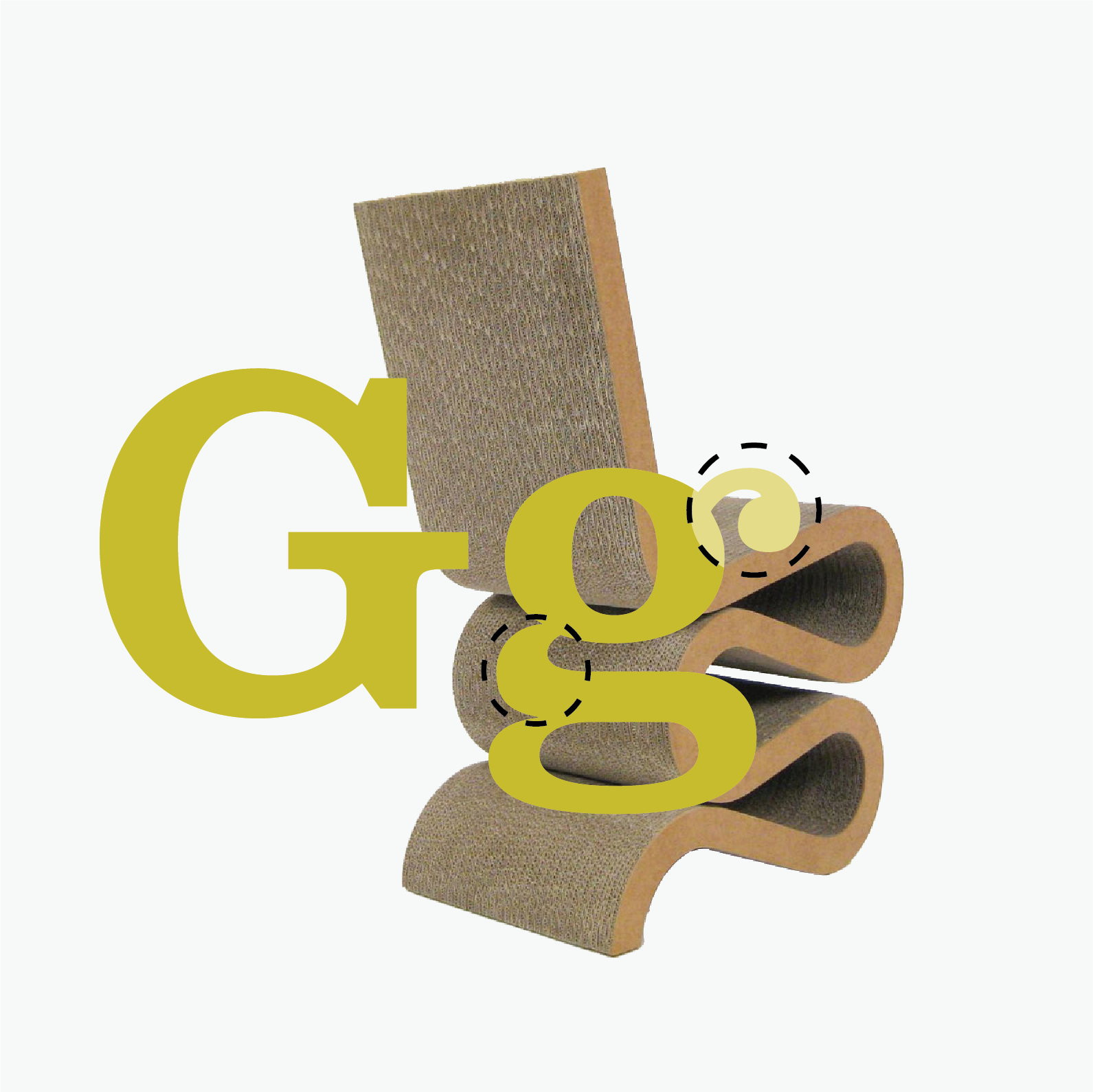
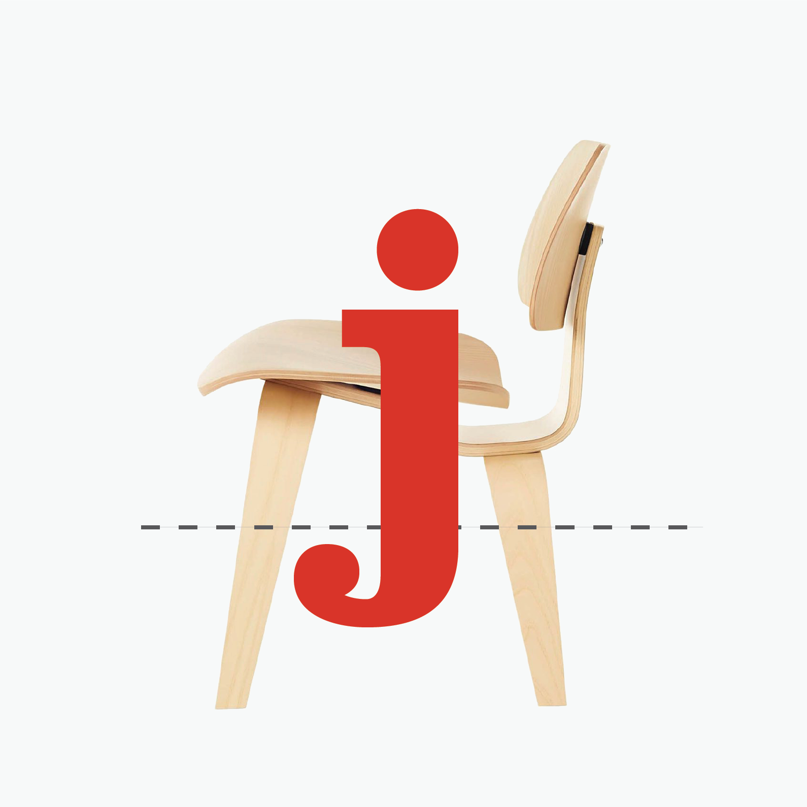
A few chair pairings that didn't make the final cut.
Designed & built in 2025 by me!